Clutter art, or, can you believe how much crap is on that porch?
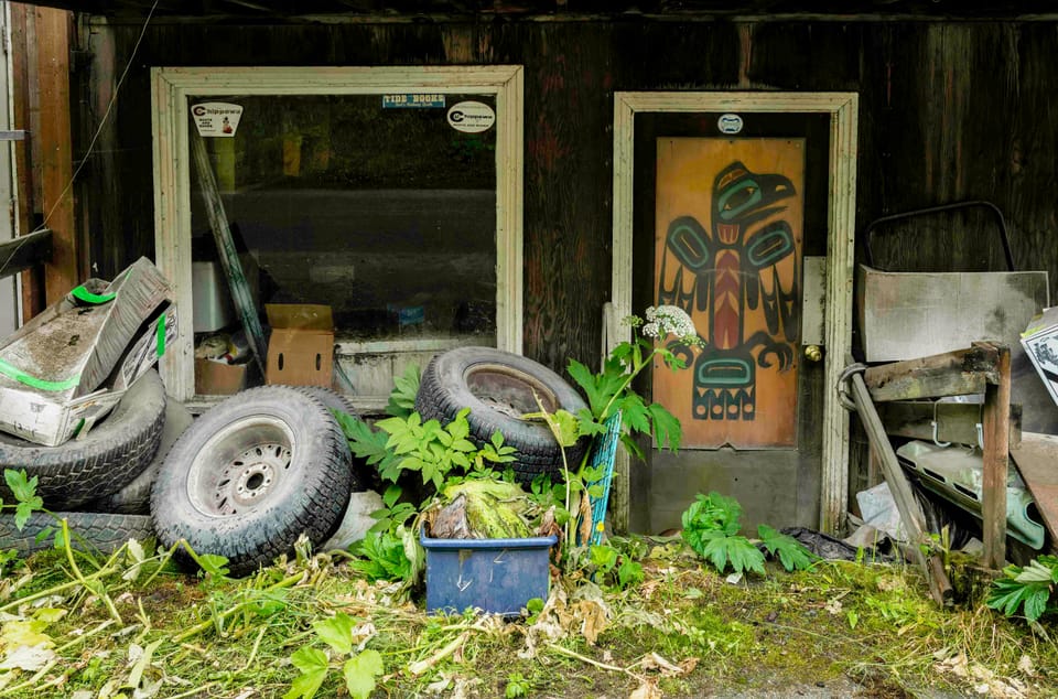
Letter No. 68: Includes dogs, worn tires, layers of stuff, and clever use of #hashtags.
Do a walkabout through online photo galleries, Instagram, Threads, and other photography platforms and you will notice that minimalism has become a thing. Photographers market themselves as minimalist, digital galleries have minimalist categories, and at last check, the #minimalist hashtag on Instagram had been applied to a minimum of 17 million images.
If you’d like to join the fun, compose pictures that frame only one or two shapes or lines, the simpler the better; include only two, at most three colors, the flatter the better; limit visual elements of any kind to an austere sparsity; smooth detail to achieve a surface gloss; and emphasize negative space, sometimes to the point where the negative space begins to feel like the subject of the image. Reduce the visible math to the simplest geometry; no fractals need apply. Monochromatic pictures lend themselves to minimalist composition, especially if the photographer has amped up the contrast and uses the word “chiaroscuro” a lot.
Minimalism in photography isn’t new, but it used to be practiced more in the studio—Edward Weston’s nudes, seashells, and vegetables, for example, or the occasional Stieglitz. Now shooters walk about hunting the simplest possible images in nature and the built environment. The latter works better. Nature has gone all in for complexity; the simplest shapes and lines are usually man-made. An exception is wintry landscapes from the Far North. I've seen no end of striking minimalist images from Scandinavia and Arctic regions. Really beautiful pictures.
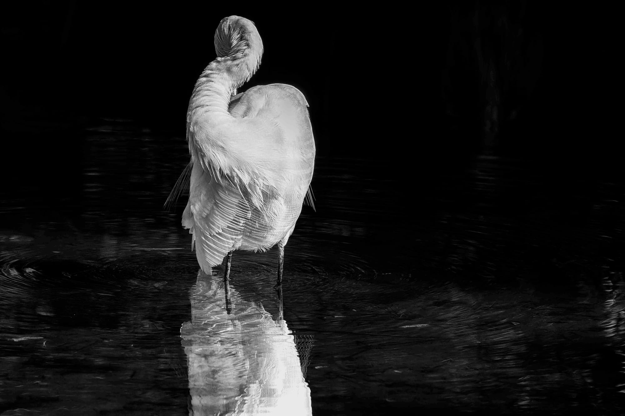
I’ve made my share of pictures that could pass for minimalist. Sometimes all I need to do is aggressively crop. Other images require more time in the digital darkroom. The photograph below, of an egret in Virginia, is a grayscale conversion of a color image, with the background brought down to black and the bird whitened by selectively reducing tints that are there in the color version. As a composition, I like it a lot, but I wish I hadn’t blown out the highlights on the bird, a rookie mistake. So it goes.
Books, articles, and teachers instruct us to eliminate all extraneous elements from our images to reduce visual clutter that distracts the eye from the picture’s subject. This is good advice for many compositions, especially in nature. A few years ago, I shot pictures in Svalbard with the superb Arctic photographer Camille Seaman, and when critiquing my pictures she always said “either it’s in or it’s out.” Meaning: Look at every part of the frame and if an object or bit of something contributes to the final image, leave it in. If it doesn’t, crop it out with no mercy.
Attendant to these trends, though, I’ve developed a fondness for clutterism: pictures in which clutter is not disqualifying, it’s the point. There is no better place to develop the clutterist aesthetic than Alaska. Houses in small Alaskan towns feature yards and porches with the most remarkable assortment of refuse, junk, tools, auto and truck parts, machinery, decoration, sometimes animals. In the Lower 48, piles of junk signify impoverishment, or at least lower socioeconomic status. In Alaska, they can be that, but they’re practical, too. Dumps can be far away, and if the town is on an island, junked trucks, worn tires, and decrepit machinery has to be taken away by boat. Who is going to pay for that when there’s more room in the side yard?
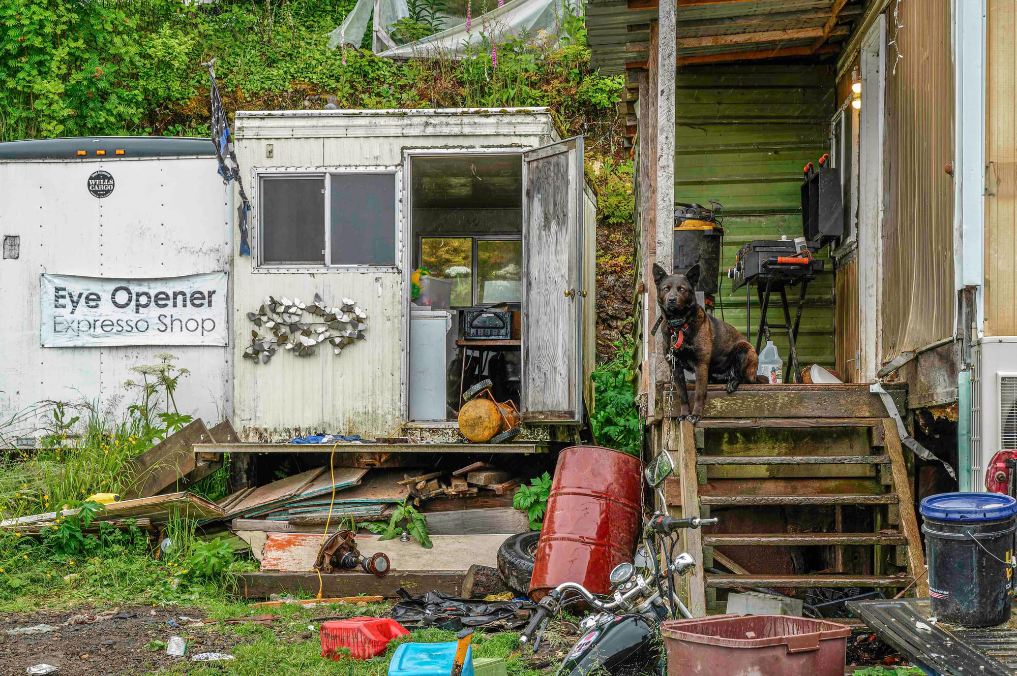
When I look at a good picture, I begin to create a mind-story. Elements of the image prompt questions and questions lead me down paths and the paths generate shards of narrative. Look at the picture below. Is the Eye Opener Expresso Shop still open for business, at least part of the year? Does the proprietor know he or she misspelled espresso? What’s in all the bins and buckets and barrels? I love the various visual bits: the shredded Blue Lives Matter flag, the butterfly adornment on the shed. And that dog! The muscular body, the visible claws, the substantial chain and collar, and the eyes. The eyes. As I composed a half-dozen pictures that day, the dog never made a sound and never took its eyes off of me. When I crept too close, it stood and silently pulled its ears back. Enough said.
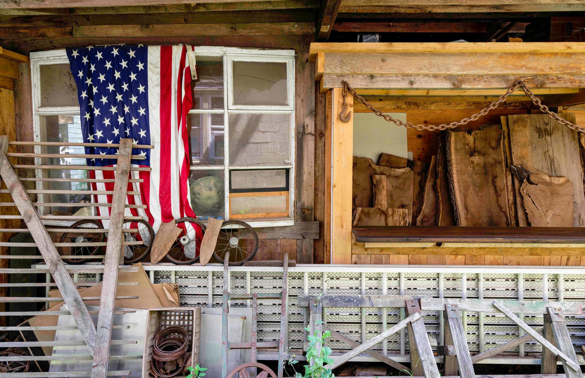
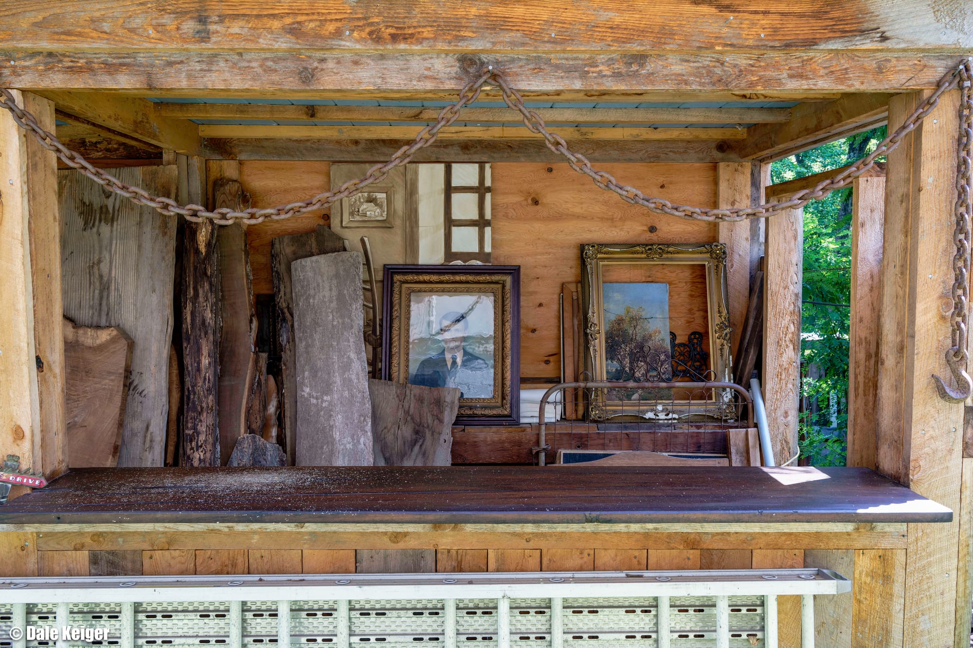
Sometimes the clutter has more intentional order than first meets the eye. I know nothing about the owner of this house (below) in Frenchtown, New Jersey, but in my mind-story an artist lives here. A patriotic artist, perhaps. The spoked wheels have been arranged with care. The metal across the bottom quarter of the image looks like scaffolding, to me, and the wood on the right looks salvaged, intended for some artisanal purpose. The next photo shows the continuation of the porch, with three paintings and a few picture frames. I love the visual element of the heavy chain and tow hooks strung like garland.
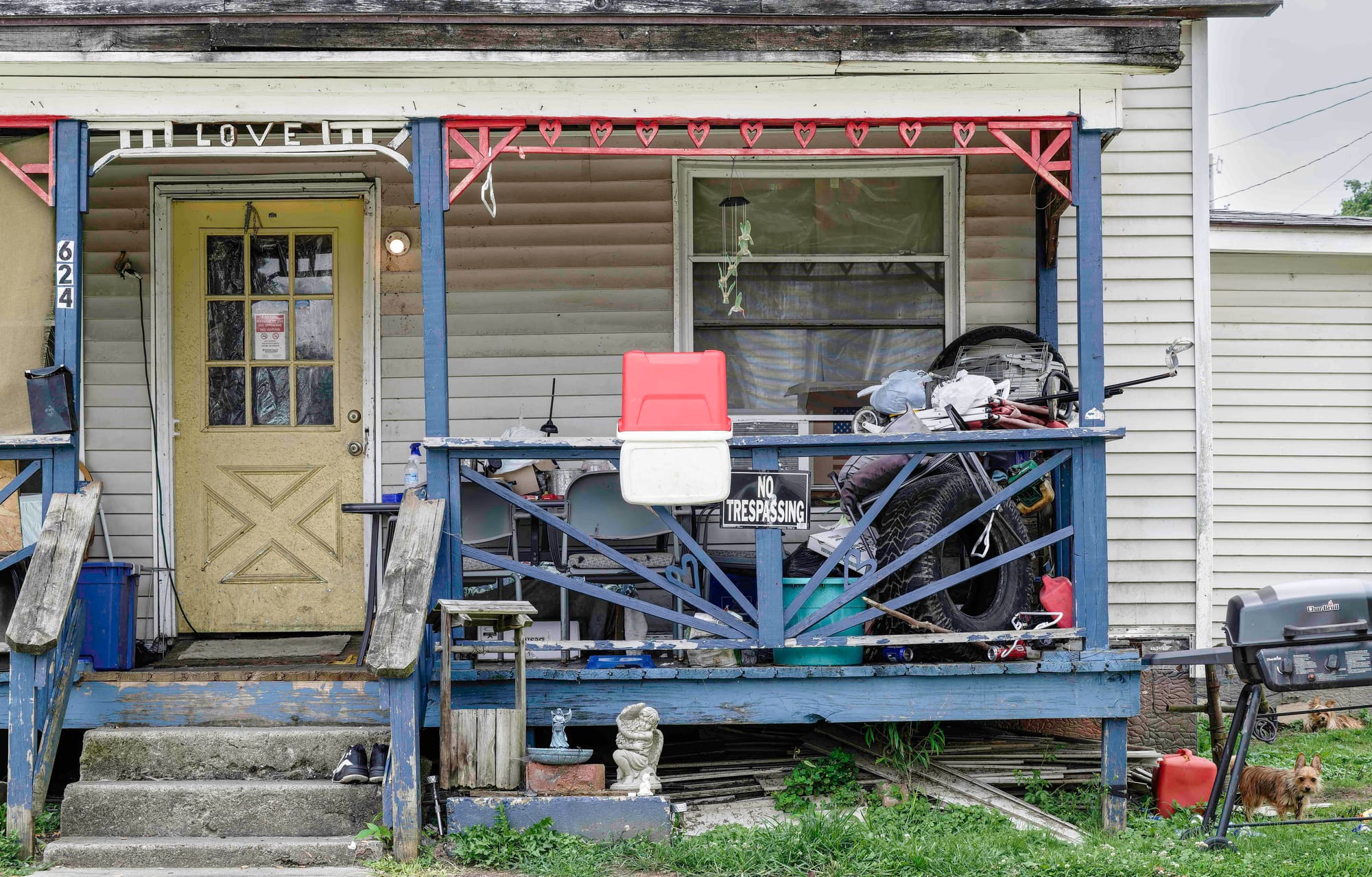
My father grew up in Cambridge, Ohio, a town far tidier than the places I’ve been in Alaska. But when I drove past the home below, someone was just pulling out of the driveway and I had to double back around the block and make a picture. You want stories? Make something of the paradox of “Love” over the steps and the string of red hearts, and “No Trespassing” on the porch rail. What about the angel lawn ornaments next to the little decorative well? A close look at the front door reveals notice that someone inside is on supplemental oxygen, please extinguish your cigarette. And bottom right corner—a pair of little dogs. Not quite as imposing as the Alaskan devil dog, and why aren't they inside the house? Whoever lives here...what’s their story? Stories?
Many #minimalist photographers fail because their pictures are too minimal. Whether you think in terms of information or visual interest, the images have too little of either one. A glance suffices to take in all that is on offer, and there’s nothing gained by repeated viewing or closer scrutiny. Too often #minimalist is more like #simple_minded. Pretty, but not beautiful. Not arresting. Not interesting. The cute guy in the primary color polo shirt, not the brooding, enigmatic figure at the back table wearing scraped and worn leather, the one who looks better the longer your gaze.
I think the iPhone has much to do with the current vogue for minimalist pictures. On any day we see dozens of pictures of every shape and size, but I’d love a nickel for every image viewed only on a 70mm by 145mm screen, and a fraction of the screen, at that. An iPhone display has remarkable resolution, but it doesn’t reward the long look. Plus the public, at least the American public, currently prefers a version of reality that’s uncomplicated by dissonance or contradiction and demands no thought. But don’t get me started on that.
(If you are reading this on your phone, please consider switching to a laptop, at least. I shoot for 12 x 18 or 24 x 36 prints, and you are missing a lot detail if your canvas fits in your back pocket.)
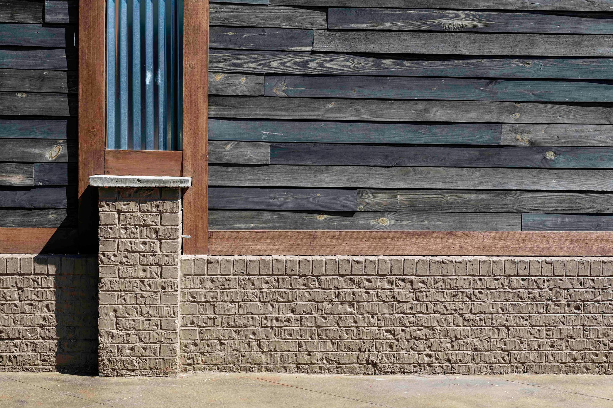
My own #minimalist photographs usually cheat. The composition is geometric, the elements few, the palette narrow. But most often there will be #maximalist texture and nuanced color and light, as I found in Spartanburg. I want you to come back and see something new on your third, fourth, or fifth look.
Embrace complexity! Viva #clutterism!
Member discussion