Green, violet, and the evolutionary imperative

The visual artist who makes pictures sees the world framed by rectangles. When I gaze at an expansive vista in the US Mountain West or Svalbard or Alaska, I am as thrilled by its sublime immensity as anyone else. But some wet cranny of my mind is quietly making compositions with rectangular dimensions. It’s not something I can turn off.
Within the frame of this imposed geometry, my eye has long been drawn to the added geometry of human structures and to textured painted surfaces. This has resulted, over the years, in scads of pictures of aged fences and battered sheds and weathered barns and windows and doors.
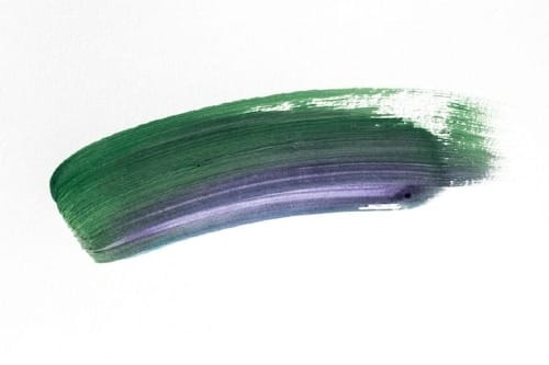
I made the picture up top in 2012, near Twillingate, a town in northwest Newfoundland. (It calls itself The Iceberg Capital of the World, and according to the 2021 census the precise population is 2,121. You cannot make that up.) I reached for my camera the instant I saw the colors. The violet surrounded by green, framed by the house’s structure… I knew I’d found a picture.
The human mind loves color. Perhaps craves color. But we’ve never been content just to take in a bold red or deep saturated blue or overbearing yellow. We evaluate and judge. We form preferences: I love green and blue, shy from orange, and don’t care much for pink. I own enough blue shirts and black pants to outfit the Amish. Why do we like this color and despise that one? Why is one combination harmonious while another so jarring we use the word “clash”? Beats me.
For centuries, the human mind, at least the western human mind, has not been content to look and say oh, that’s pretty and be done. It has interrogated, at considerable length, color’s effect on our senses and our moods. Both great and eccentric minds have labored to order colors in a Linnaean classification system, and to define relationships and formulate theories. Aristotle took an early crack at it, unless On Colors was the work of Theophrastus or Strata; scholars bicker as to authorship. Pondering the relationships among colors really got going in 1666 when Newton took the linear spectrum produced by sunlight passing through a prism and deformed it into a circle, a sort of Ouroboros spectrum.
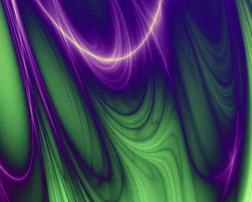
Clever move on Sir Isaac’s part. The linear prismatic rainbow displayed only one relationship—adjacency. Red was next to orange next to yellow next to green, all the way down to violet. But the color wheel revealed new geometric relationships. Draw diagonal connections or triangles or squares, and you suddenly had a whole new way to think about color—by defining and describing something that isn’t actually there. Green does not have a relationship to purple until we create one. Until we measured its wavelengths and imposed math on it, color was just color. A person, a cat, a rock, water—these things exist on their own whether we describe them or not. But an aesthetically gratifying relationship between green and violet doesn’t exist until I turn my gaze to it and think, There’s a picture.
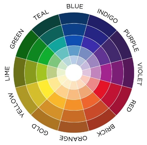
Scribe a diagonal from a certain violet hue on a color wheel, and you connect to a certain green hue on the opposite side. Call it yellow-green, which is imprecise but will do. In color theory, the two are designated as complements. Were they that before the theory? I’d say no, but who cares? Interesting things result from the relationships limned by the math. Colors opposite each other are pleasing to the eye when plucked from the circle and situated side by side. Why is that? Because color.
A glance at the color wheel suggests the need to nudge that diagonal a bit to make yellow-green a true complement of violet, rather than the pure yellow that seems to lie opposite, but work with me here. Take a circular cardboard disk. Paint 36 percent of it yellow-green—the precision matters—and the remaining 64 percent violet. Now push a sharp stick through the center so you can rapidly spin the disk. Spin it fast enough and in your mind’s eye the colors will merge into gray. Or so says Emily Noyes Vanderpoel in her Color Problems: A Practical Manual for the Lay Student of Color. I feel no need to go beyond taking her word for it. This phenomenon, she says, proves the complementarity of the two colors. Good enough for me.
Of course, color does have actual existence in one sense. Violet is what the visual cortex creates when light that is 380 to 435 nanometers in wavelength, give or take, strikes the retina. A wavelength of roughly 545 to 575 nanometers registers as yellow-green. That’s the closest thing to a physical existence for our two lovely hues.
You don’t have to ponder for long before this seemingly concrete existence starts to become vaporous, though. Light of a specified wavelength may exist, but it is violet because at some point we decided to call it that. The light’s always been there, at that wavelength, but violet didn’t exist until we invented it. I think, therefore violet.
So, to review, 1) color exists, and 2) color is a figment of our imaginations. Hold those two ideas in your mind at the same time. Well done. You are now Buddhist.
Pair a violet or lavender linen shirt with olive green trousers. You are now a well-dressed Buddhist, and don’t let anyone tell you different.
Among the great minds that have devoted themselves to color: Aristotle, Newton, Goethe. In his Theory of Colors, Goethe notes:
The female sex in youth is attached to rose color and sea-green, in age to violet and dark green. The fair-haired prefer violet, as oppose to light yellow, the brunettes, blue, as opposed to yellow-red, and all on good grounds.
By that reading, the Twillingate picture appeals to my inner fair-haired woman across all ages. I’ll just leave that there.
Among the eccentric minds that have devoted themselves to color: Johannes Itten, the Swiss expressionist painter who became a central figure in the Weimar Bauhaus. He devised a series of exercises to teach what he considered the seven types of color contrast, and wrote a book, The Elements of Color. He saw musical harmony in color relationships, and geometric shapes. Green, to Itten’s mind, was a triangle with sides that bulged outward. Violet was a horizontal oval, like a lozenge. I don’t know what to make of that.
Itten was a follower of Mazdaznan, a neo-Zoroastrian religion that advocates restoring Earth to an Edenic garden where people all cooperate and regularly converse with God. I don’t know what to make of that, either, but it’s a pleasing idea.
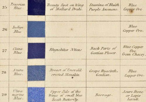
Another eccentric thinker about color: a painter of flowers named Patrick Syme, who in 1814 assembled an odd but lovely little book, Werner’s Nomenclature of Colors, with Additions, Arranged So As To Be Highly Useful to the Arts and Sciences, Particularly Zoology, Botany, Chemistry, Mineralogy, and Morbid Anatomy, Annexed to Which Are Examples Selected from Well-known Objects in the Animal, Vegetable, and Mineral Kingdoms. Syme based his epically titled book on the system for identifying minerals created by geologist Abraham Gottlob Werner in Saxony. Werner was concerned only with rocks. Syme broke down the spectrum into 110 hues and for each noted an animal, vegetable, and mineral example of that color in nature. No. 1 was Snow White, found in Carrara marble and the breast of a black-headed gull; no. 110 was Blackish Brown, found in the physical world as pitch and on the forehead of a foumart, which is a European species of polecat.
I own a copy of this book. Per Mr. Syme’s classification, my Newfie clapboards are “Celandine Green, composed of verdigris green and ash gray” and found on the backs of tussilago (coltsfoot) leaves. The shutters are, approximately, a desaturated violet purple, “Berlin blue mixed with red and a little brown,” as occurs in amethyst and the purple aster. Picture coltsfoot leaves scattered over amethyst. Lovely.
Among lyricists, purple is avoided as a word that lacks rhymes. True, in one of his poems Robert Burns did employ “hirple,” which means “to hobble like a hare.” Burns also used “curple” as a stand-in for his arse. But he wasn’t writing for Broadway or the Top 40.
In my visual mind, there’s no such problem. The right green and the right purple make a rhyme sublime.
All but the color-blind have favorite colors. Favorites vary from person to person, but everyone has one, except maybe my father. He had trained as a painter and said that when he looked at any color, he didn’t see one he liked or disliked, he just saw possibilities, what he could do with each hue in a picture. That said, I will note that our house contained a lot of blue stuff. Somebody had a preference.
But why should this be? Is there an evolutionary reason for preferring blue to brown or green over orange? Much research has been done on how the retina and the optic nerve and the visual cortex of the brain work. But the evolution of an emotional response to color has been much less studied.
A couple of Cal Berkeley psychologists named Stephen Palmer and Karen Schloss published a paper titled “An Ecological Valence Theory of Human Color Preference.” The introduction reads, “In this article, we articulate an ecological valence theory in which color preferences arise from people’s average affective responses to color-associated objects. An empirical test provides strong support for this theory: People like colors strongly associated with objects they like (e.g., blues with clear skies and clean water) and dislike colors strongly associated with objects they dislike (e.g., browns with feces and rotten food).” Which, to me, begs a question: Do we like blue because it reminds us of the sky, or do we like the sky because it’s blue?
(A digression: The same study found that Japanese subjects reported different preferences from Americans. So… Japanese people don’t like the sky as much as Yanks? Seems odd.)
Another paper, “Understanding Color Perception and Preference,” posits, “More recent studies demonstrate both universality and individuality of color preference, as well as mutability across culture and age. These variations in preference, and other evidence, argue that the ability to form emotional associations to color, whether on an ontogenetic or evolutionary timescale, is deeply embedded in human nature.” I hate to sound disrespectful to the authors, who were researchers at Newcastle University in the UK, but, No shit?
Dr Essai has his own theory. Consider how impoverished the visual arts would be if there were no color preferences, if the human mind lacked an emotional response to color, wasn’t mad for Klein blue or was not delighted when the 1980s fashion for mixing lime green and hot pink died out. What would painters or photographers do? Would there even be visual art as we know it? Which brings the doctor to his big idea: Humans evolved color preferences to further the creation of art. This makes art an evolutionary imperative, and why not? One of the drivers of this imperative was color. Once our brains evolved to respond to color as we do, we never looked back. Hand me that brush, said Leonardo.
A quick scan of the scientific literature turns up no research findings supporting this idea. Does the doctor remain convinced, all the same? You bet your sweet curple.
Other Joggles that discuss color: Imagining the Sullen Cave Girl Who Became the World’s First Artist, Marooned On the Way to School.
Member discussion