Hey, good lookin’, love your information

Letter No. 63: Includes discussion of silver halide, photons, egrets, and one tossed-off analogy.
On a November Saturday at the Chincoteague National Wildlife Refuge in Virginia, I took a few thousand pictures of a handful of birds, mostly egrets. These were great egrets, the ones nearly slaughtered out of existence in the late 19th century. Their plumes were all the rage for aigrettes, feathery decorations that adorned hats. Fashion almost put an end to them.
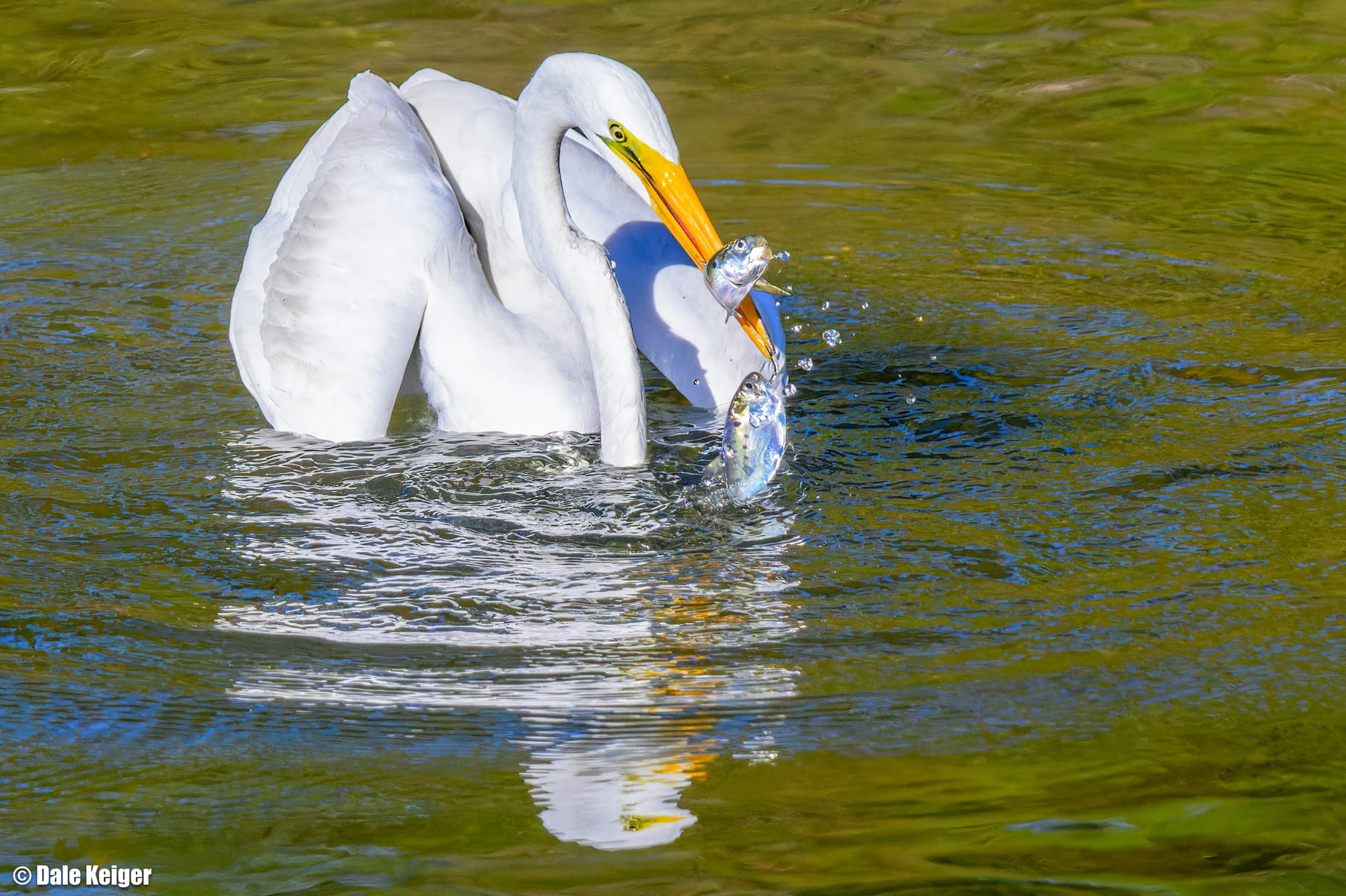
As subjects in the viewfinder, egrets make it easy. They’re large, they’re not skittish, and they stand still in shallow water for hours waiting for a doomed fish to swim by. When one does, the egret spears it with its beak, jostles it into position, then swallows it whole. Chincoteague sushi.
From an artistic standpoint, the problem with egrets is they have been photographed a zabillion times. How do you create an image that doesn’t look like one more thumbnail pic in a birding guide?
First, you shoot a couple thousand raw images. Then you mine them for information.
Photographers have always dealt with information, they just didn’t call it that until the advent of digital image technology. When we shot film we concerned ourselves with figure and ground, light and shadow, curves and leading lines, light ratios, contrast, grain, definition. Every one of those elements was the result of light striking film and creating information that the film stored. Photons zipped through a lens and struck silver halide crystals. Each collision recorded a microscopic bit of information.
Film has never been a neutral medium. Each brand recorded photonic data in a different way. Kodak Tri-X, Agfa, Ilford Delta, Fuji Neopan—all had unique profiles, some more grainy than others, some known for high resolution, some emphasizing contrast, some flattening it out. Different films conveyed different moods because they “read” light in unique ways; a monochrome image is a grayscale rendering of colored light, and various film stock read each color of the spectrum in different ways. Skilled photographers learned to select film type to produce a desired aesthetic outcome.
Exposed film contained more than a record of the light that struck its crystals. It also contained emotional information that might not be immediately apparent but was there all the same. A skilled printmaker manipulated how more light was projected through the negative onto photographic paper to finally produce an image that evoked an emotional response. The type of paper used for the print (and the size of the sheet) resulted in more manipulation of information for aesthetic effect, but we’ve gone deep enough here.
Digital photography deals with information more explicitly. Those of us who shoot with digital cameras and process the images on computers are always talking about “the information in the image.” A single frame of film was a rectangular collection of crystals that had recorded the impact of photons. A single digital image is a computer file that records the impact of photons on an electronic sensor, coded as 0s and 1s. Different medium, same deal.
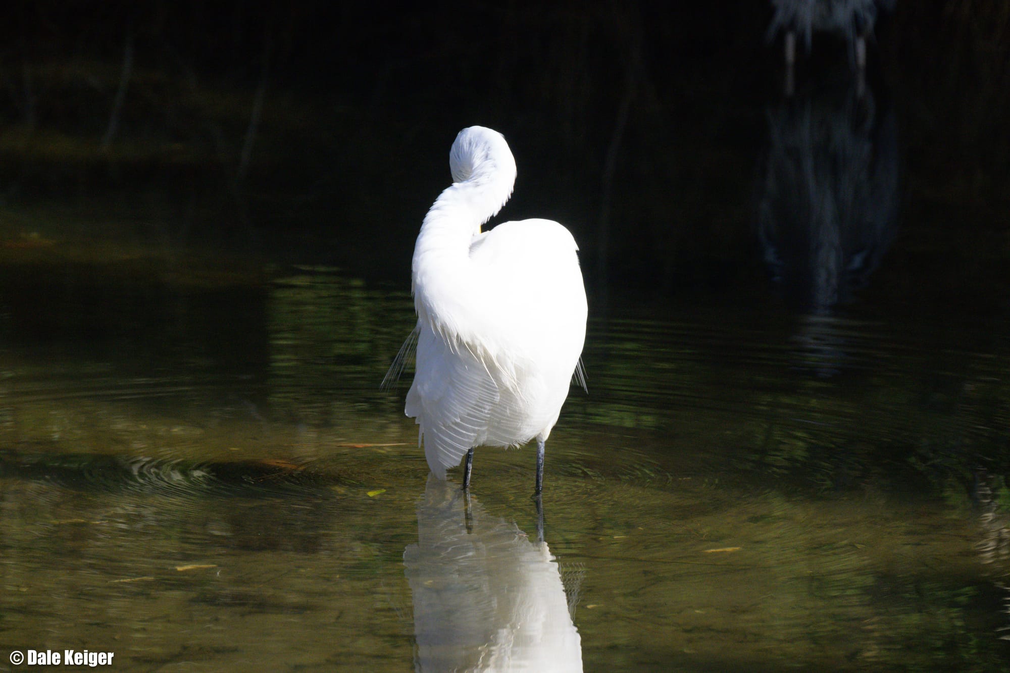
Let’s use an example from my recent trip. Egrets mostly stand still, but they also scratch and stretch and preen. (And they kill a lot of fish. Much different photographic outcome.) After my trip, as I sorted dozens and dozens of egret pictures, this one snagged my attention because of the rounded contours of the bird’s body in this unusual posture. Egret geometry is often sharp and angular, especially around its head. But this image was all soft curves and feathery roundness, without the predatory menace of the beak and eyes. Plus there was a visually interesting reflection. I sized it up on my computer screen and thought, There might be something here.

As a raw image (the one above), the equivalent of what I might have seen had I been projecting the picture through a film negative onto paper, it had a lot wrong with it. The colors were muddy and dull. The progression from light at the bottom of the image to shadow at the top was boring. More than half the bird’s body was a white blob with no detail and thus no interest. In its raw form this looked to be one crappy picture.
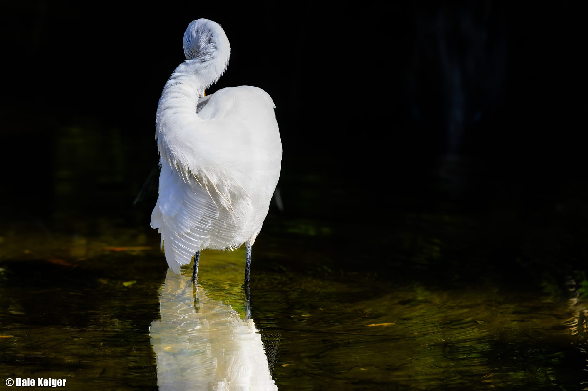
But I knew there was more information in the photo than what I could see in the original untouched version. What was before my eyes was how processing software initially read the 0s and 1s in the image file, and at this point the software was akin to a literary translator who has only a basic working vocabulary in the language of the original text. My task now was to find the art that might be lurking in the raw data. For example, I knew the sensor had recorded far more feathery detail in even the brightest part of the exposure. Processing software let me bring that out, refining the white blob into a complex overlay of feathers. I didn’t add anything that wasn’t already there. I simply pulled some signal from the noise.
There was also more contrast hidden in the image. By darkening the background—in this case, all the water surrounding the white bird, I could begin to bring out some mystery and drama, emotional information. (Back in the film days, this darkening in the lightroom was called “dodging.”) I could draw the eye to the lovely conformation and texture of the egret by reducing the information around it. I didn't care about the other diffuse reflections in the original background and the subtle ripples and the random stuff floating in the water. By dimming the elements competing for the viewer’s attention, I pulled the eye to where it belonged: the bird.

Now the picture had my attention less because of what was there than what I imagined could be there. Experience hones instinct, and I knew to keep gazing at what was now a better but still pedestrian image. Something far more striking was hiding in plain sight. I wasn’t documenting wildlife here, I was manipulating shadow and light, figure and ground, to generate emotional impact and reveal beauty that could not be appreciated from an everyday snapshot of an egret.
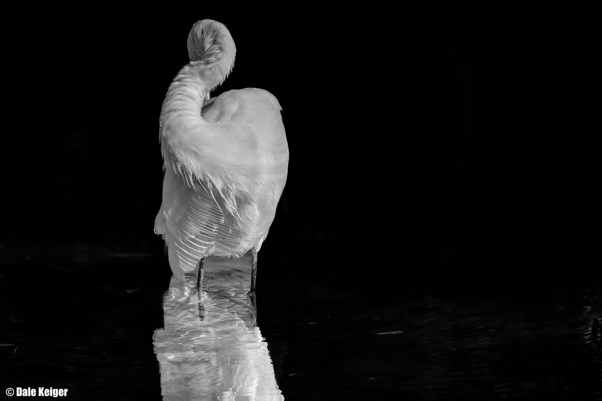
The solution—my solution, at any rate—was to eliminate the distraction of color and craft a monochrome image. I converted the picture to grayscale and pulled down the light on the water until it was black, except for the bird’s reflection. I accentuated certain elements by filtering the red end of the spectrum. I didn’t want the viewer to glance at the picture and think, egret. I wanted the viewer to gaze at the image and respond, without rational thought, to the sinuousness of the bird’s body and the complex texture of the feathers. I was delving information for beauty.

Did I end up with art? Eh, that’s for each of you to judge. I’m excited by the image, I think it’s very good, but it was just rejected by a gallery, so there you go. The picture still has a few problems that perhaps could be eliminated if I had more skill. But it’s the flow state I entered while working on it that matters to me now. The finished picture was the destination, but it wasn’t the point. Creating drives the artist, not the creation. That must seem nuts to much of the productivity-obsessed world, but so be it.
There’s a whole analogy here to a writer working with language, but I’ve detained you long enough. Give one more look to the beautiful bird and off you go, with my thanks.
Bonus: I mentioned the different photographic outcome from an egret fishing. Here’s what I meant.

Member discussion